Please share with your friends!

Introduction
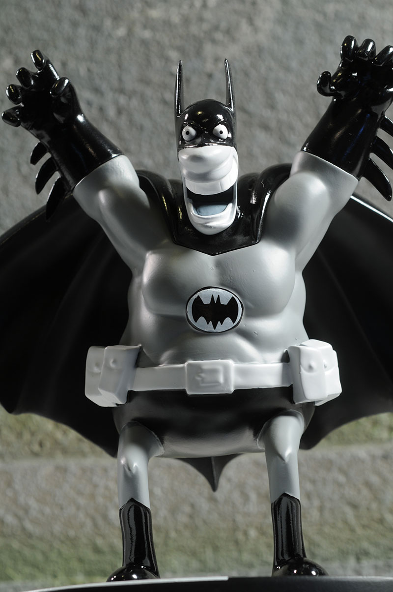
10 - Sergio Aragones, James Shoop, 2012
I usually have one pick that's more than a little odd on every list, and the Aragones Batman fits the bill this time around. The only reason he ended up in tenth,
rather than a higher slot, is the poor paint work with this release. I love Sergio's style, and including a silly, fun, goofy Batman like this adds an air of whimsy to
the collection. I just wish the execution had been a bit better.
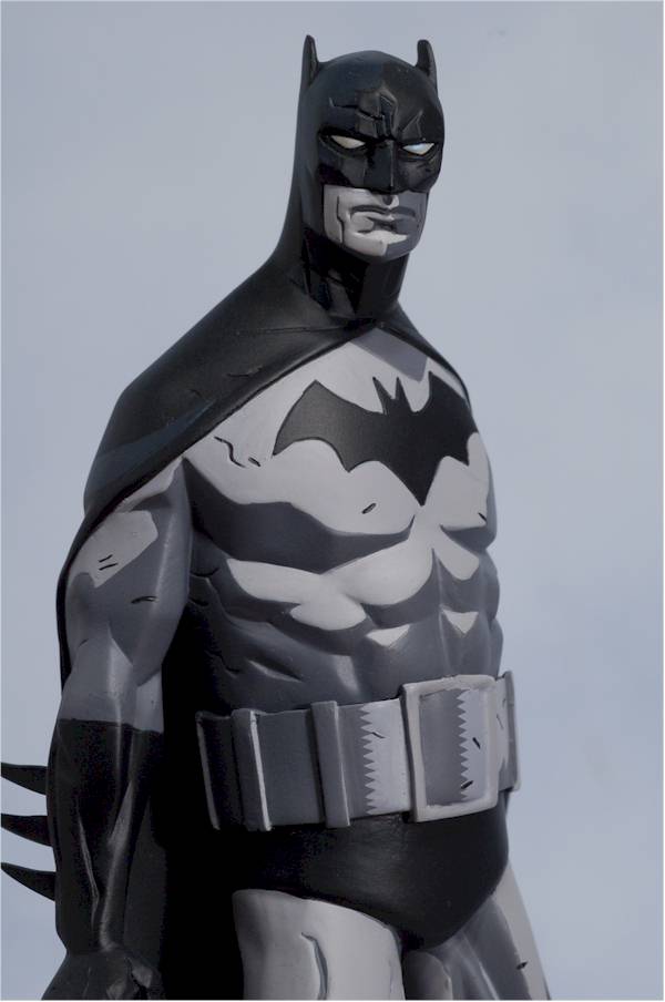
9 - Jim Lee, Erick Sosa, 2007
Lee is a modern age master, an artist that both young and old fans can agree upon - sort of. His artwork has been used a number of times in this series, but it
was the first statue in the series based on his designs that made it on my list. I'm a big fan of any of the designs that manage to incorporate highly dynamic poses
that set them apart, but don't look silly or weird. That's not as easy to do as you might imagine. Here you get a very classic looking Batman, landing on the
ground with his cape billowing out around him. It works for me, and is one of the few crouching designs I really like.

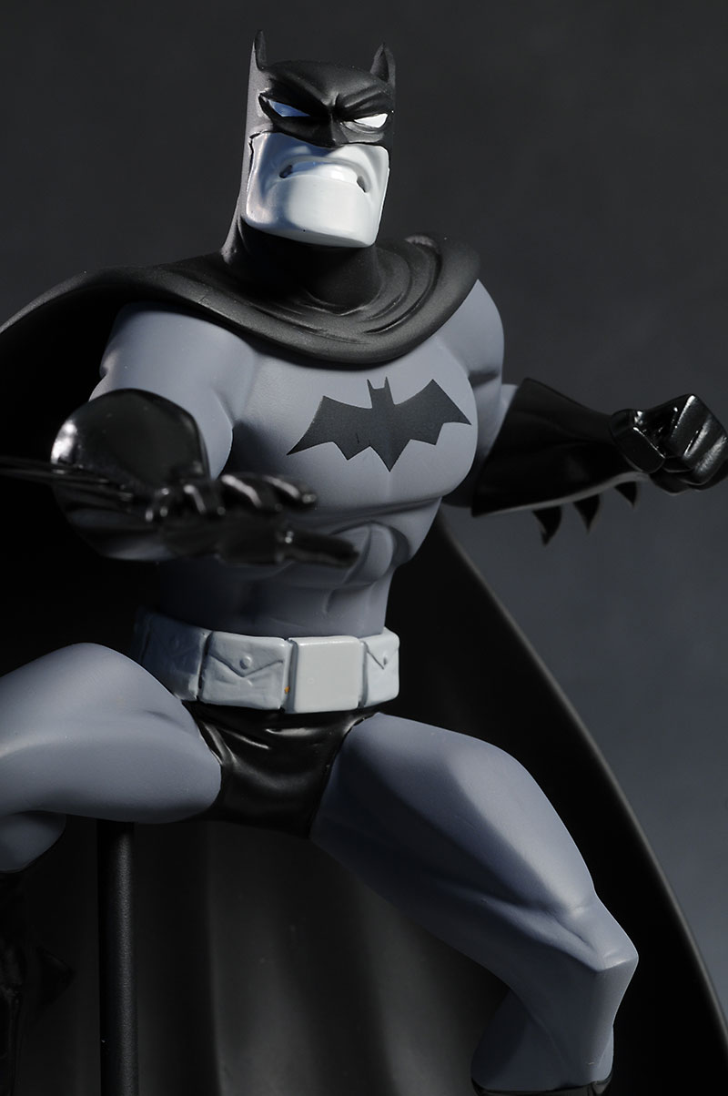
8 - Gotham Knight 2, Bee Train, Derek Miller 2009
Gotham Knight is an animated film comprising six short stories. While it's intended to fill in between Batman Begins and the Dark Knight,
the stories could fit within various time lines and aren't necessarily 'canon'. However, they were well done, and two Batman Black and White statues were produced based
on the movie. This is the second, hence the '2' in the name. The first was based on the final segment, "Deadshot", and while I like it, the design
didn't wow me quite the same way. This second version, based on the segment "Field Test", is the most futuristic of my top ten picks. The armor looks great,
and once again I love the highly dynamic pose.
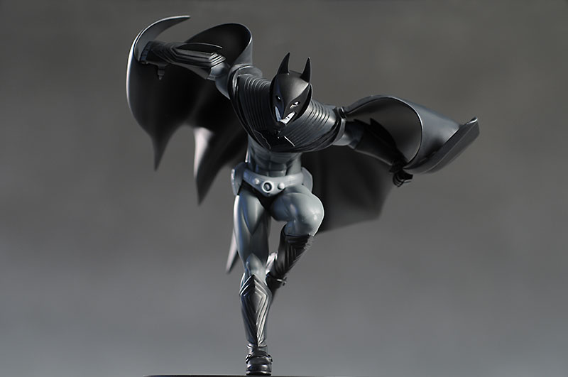
7 - David Finch, Mike Locascio, 2011
This selection is one of the more modern designs you'll see in my list. Finch did double duty on the series Batman: The Dark Knight, and while it initially
launched pre-New 52, it relaunched as part of the reboot. Technically, that makes this design the only New 52 in my list, and I'm not surprised.
The dynamic look works again for me, particularly with the way they've incorporated the base. Batman is stepping up onto it, implying it's an actual thing within his universe. That's another feature I appreciate, and it makes the base itself seem less out of place.
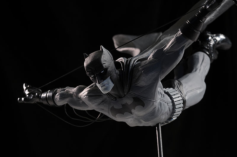
6 - Jock, Mike Locascio, 2010
Several of my picks were so good, so well received, they they were re-released a second time just to fulfill demand. The Jock design is one of those.
Born Mark Simpson, Jock is another modern artist that made it to my list. This one isn't so much about the artwork itself though, but the design of this specific
statue. Fun fact, this isn't Bruce Wayne depicted here, but Dick Grayson filling in for him. The pose is very much 'falling with style', a head first swooping
dive that has terrific lines and balance. Some may not like the metal post that's required to support him, but I can overlook that detail in my appreciation of
the bigger picture.
5 - David Mazzucchelli, Jim McPherson, 2009
Mazzucchelli hasn't done a ton of Batman artwork, but his run on Batman: Year One was classic stuff. This statue shows how you can do simple right, with just
enough detail and texture to mirror the comic style. The pose couldn't be less dynamic, and yet Batman seems ready to attack, poised for an assault. There's a bad ass
attitude to this stance that works extremely well in the black and white context. It's the simplest, cleanest design in my top ten, but it's a great example of less is
more.
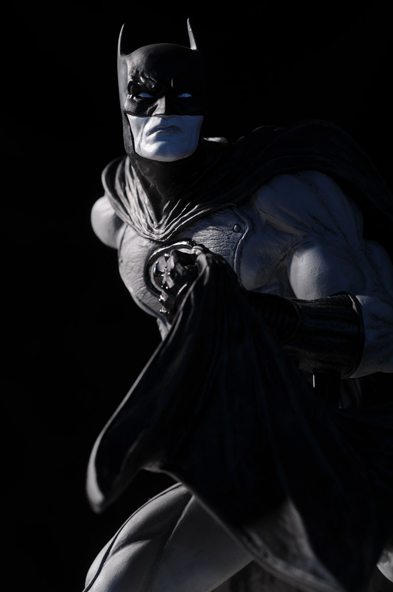
4 - George Perez, Karen Palinko, 2008
George has been a personal favorite since the 70's, and his clean, strong lines have given us a strong, well developed Batman. While we've seen lots of artists do the
buff Bats, it's Perez who did it the best. This statue might seem simple at first, but the very dynamic cape lends an air of movement and flow. He's coming to get
you - you better run.

3 - Bruce Timm, James Shoop, 2009
I've mentioned many, many times that the animated universe, created by Bruce Timm, is my all time favorite incarnation of Batman. No surprise then that the Batman
Black and White statue based on his style would be high on my list.
The leaping pose helps too, although some people may find the same fault as with the Jock statue - the metal rod that keeps him aloft. Here it's even less of an issue for me since it blends in nicely with the cape behind it.
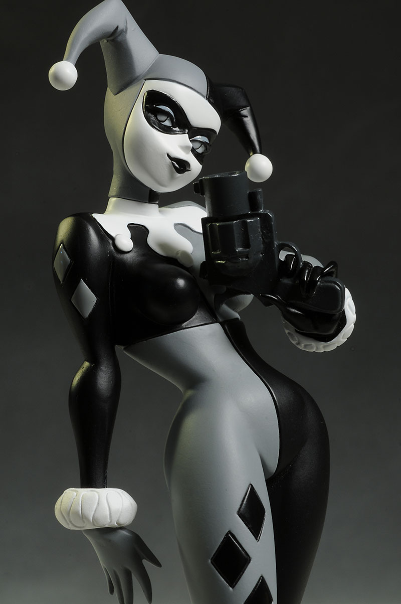
2 - Bruce Timm Harley, Jonathan Matthews, 2014
Guess what - I love Timm's designs. I love Harley. This Black and White edition was a fantastic statue, and captured her attitude and personality from the show
perfectly. There have been a number of villains included in the series so far, and the Jim
Lee Joker and Man-Bat were both on the list of finalists, but they can't even come close to the perfection that
is Harley. BTW, the statue does come with a little gray gun smoke effect for the barrel, but I actually like the way it looks without it better.
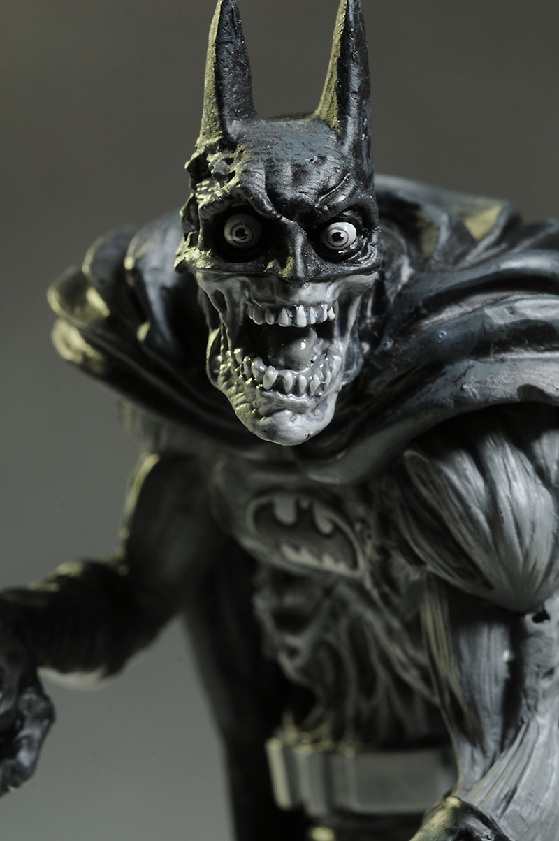
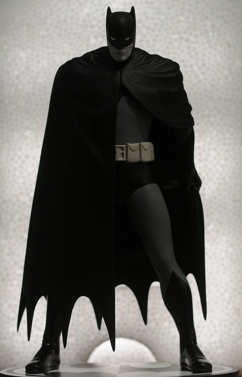
1 - Mike Mignola, Jonathan Matthews, 2006
Mignola is best known for his own creation, Hellboy, but he does a mean Batman as well. While the sculpt captured the slant shouldered, slightly odd body shape of
the comics perfectly, it is really the paint job that puts this one at the top of the list. They used the black and white scheme to perfectly mimic the comic
artwork, creating the most eye catching release of the entire massive series. This is another of those popular releases that required a second run to help fill demand,
but the original first edition still garners hundreds of dollars on the secondary market.
In Closing...
The Batman Black and White statue series is a very long, very successful one. It's had highs...and lows...but picking just ten favorites was tough. My personal
preference for the more dynamic designs is pretty evident, but the animated style of Timm and the exceptional paint work on the Mignola ended up topping everything
else.
It's interesting to note that while the black and white scheme is intended to provide consistency in the display and series, it's really that very same paint job that makes specific statues stand out.
So what's your list look like?
If you're enjoying this concept of Captain Toy Picks, drop me a line and let me know!
Please share with your friends!
![]()
Photos and text by Michael Crawford.