|
Spider-man
Super Poseable Spider-man, Sandman and Scorpion
|

|
There's a new guest reviewer in town tonight, and his name is Matt.
He's checking out some of the newest Spider-man figures - swing into it,
Matt!
Hey everybody, my name's Matt, but people online know me as "VENOM." Anyone who knows me knows that I love Spider-Man, and I love action figures, so naturally, figures pertaining to Spidey and his universe are what I like to collect.
I'm not a completist. I only get the figures that I think are cool. I also don't sit around waiting for stores to open to get the rare toys. I'm just extremely lucky (incidentally, I worked for Toys "R" Us for two years before I got my new job, and I never really saw anything rare. Now that I don't work there anymore, I see stuff all of the time, even though I don't always buy it. I think that's weird, but I digress). I stop by a random store now and then on the way home from work, and just seem to stumble across some of the great Marvel figures that Toy Biz has been producing the past few years, and boy am I lucky! It's three of those figures that I'll be reviewing today. Anyway, on to the reviews of Scorpion, Superposeable Spider-Man (aka McFarlane Spidey) and Sandman!
|
|

|
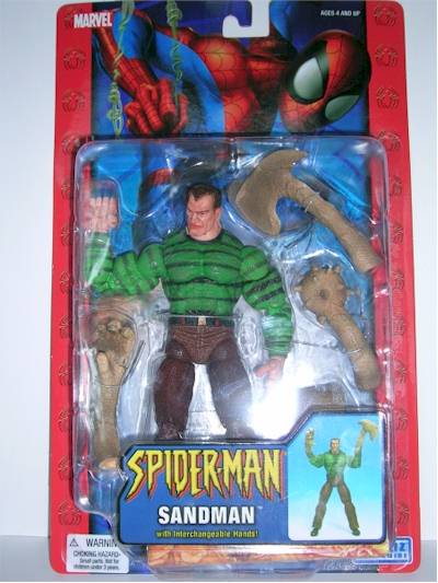
Packaging - ***1/2
I'll be honest here and say that the packaging is boring. It doesn't really jump out at you and it's not real collector friendly. Why three stars then, you ask? Well, it keeps the cost of the figures down, for one thing. It's also a line aimed not at people my age (I'm in my mid-20's), but kids, and trust me, a kid can get into this package much easier than a clamshell (which I love) and they won't need scissors to open it. So in the end, I take a half-star away for being kind of boring, and another half-star for having twist-ties, which I really hate and just don't understand the purpose for, other than theft-prevention. Three stars overall because it does it's job (it's kid friendly) but it could be more attention grabbing.
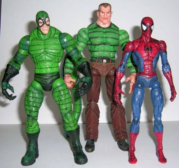
Sculpting - Spider-Man: ****; Scorpion: ***1/2; Sandman: ****
All three figures have excellent sculpting that really captures the characters, in my opinion. Bare in mind, that I'll take articulation over sculpting any day, but a balance between the two is nice, and these figures have that balance. If you fall more on the sculpting side of the fence, you might take a star away here, as the joints are clearly visible. But to quote Joe Dirt "it don't bother me none."
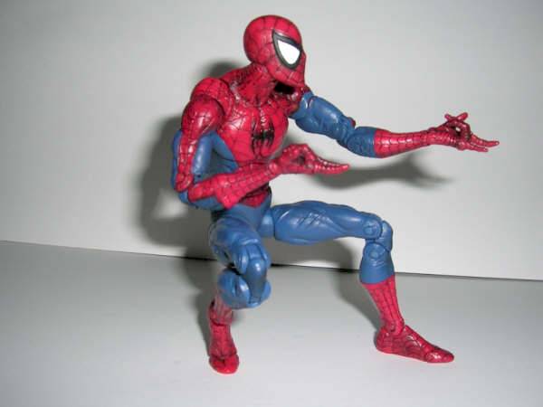
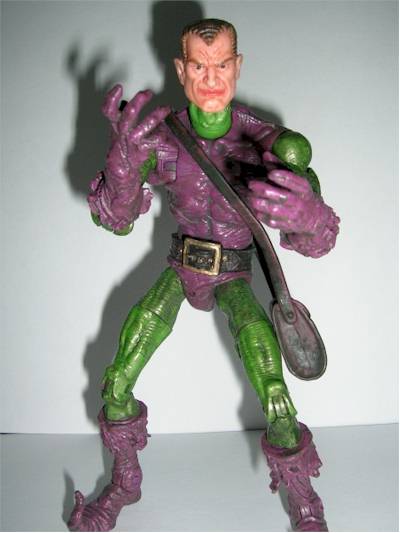
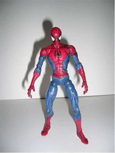
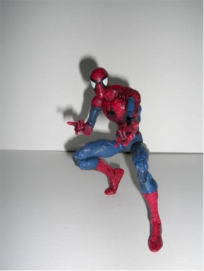
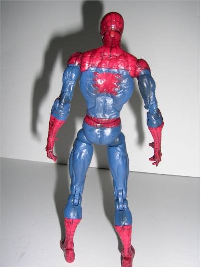
Spider-Man: ****
Spidey is probably the standout here as he really captures the late 80's/early 90's look of the character. Since I started reading Spider-Man comics in the late 80's, it's natural that this is the look that I prefer, and I'm quite pleased with how this figure turned out. It's really spot on. Just think of the original Spider-Man Classics Spidey from a few years ago, but add on a few years of sculpting and articulation advancements, and you have this figure in a nutshell. Nothing to complain about here, so I'm moving along to.
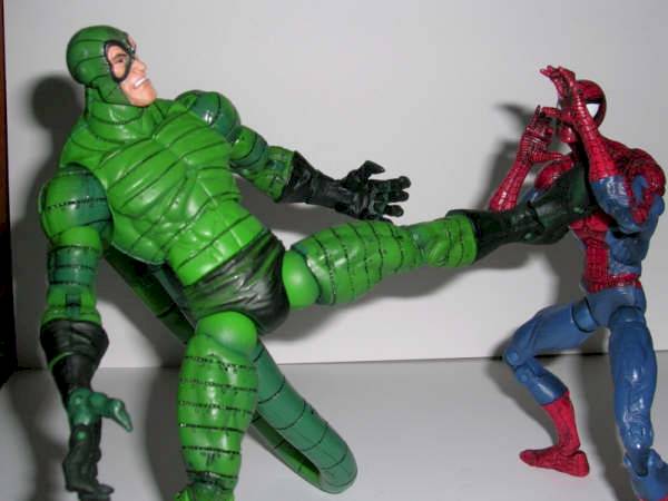
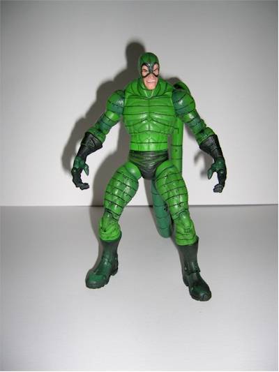
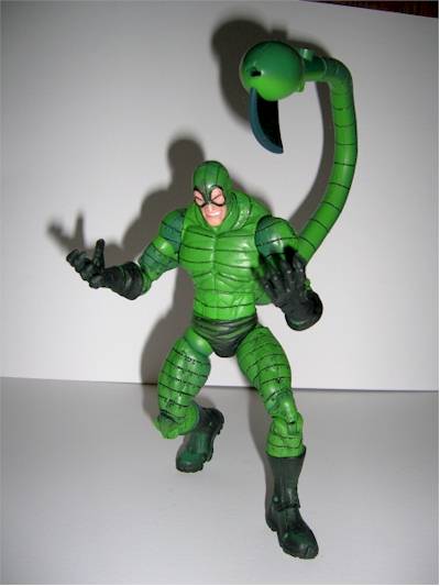
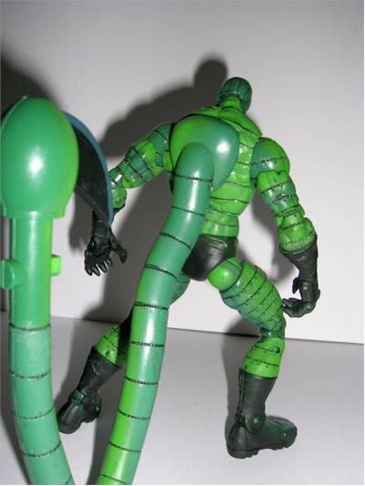
Scorpion: ***1/2
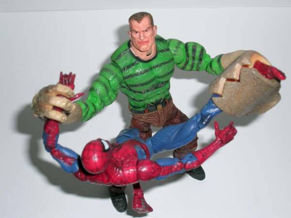
Scorps has a great look and this figure may not be entirely comic book accurate, but it kind of picks the cool bits from his different looks and comes away with a simple, yet dynamic sculpt. His costume, while not metallic looking, per se, has a bit of an industrial look to it, and you can see and feel rivets all over his armor, really making it look like he's encased in it (and that's a good thing). I took a half-star away because I think his face-sculpt is a little odd. It certainly looks like the Scorpion, but his expression doesn't look as mean as it could have. This could also be due to the paint-job on this particular figure's head, which I'll touch on later.
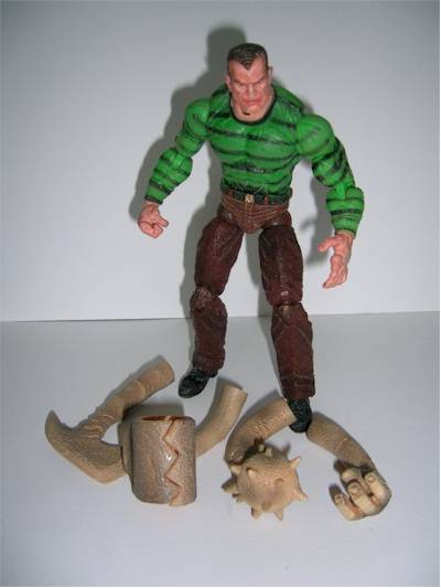
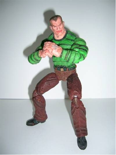
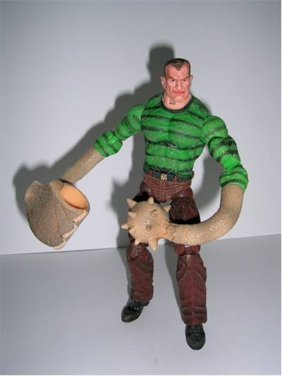
Sandman: ****
Mr. Marko is in fine form here with a great head-sculpt and that quality stays top-notch all the way down to his feet. He has a look that seems strong, yet cocky, and I like that for his character. He can turn into sand, after all, and that's pretty cool. I've never really been a Sandman fan, but this figure is awesome. All along his body (with the exceptions of his head and normal hands) he has what I guess I'll call pockmarks that really do a good job of making him look like he's made of sand. It's simple, and effective. He's a little tall, in my opinion, bigger than both Spider-Man and the Scorpion. I don't really think of Sandman as tall, but he's often open to artistic interpretation, so I don't mind. His look comes from his classic appearance, complete with "Osborn-Like" hair. In fact, as a side-note, the head sculpt would make for an awesome Norman Osborn custom, if you're into that.
I have a laughingly bad example in the photo on the left. If you do it, you'll want to make sure Osborn is as equally bulky as this figure, unlike the Green Goblin body from the Sinister Six set, like I have, which is wicked skinny, and will make him look like a bobble-head.
Paint - Spider-Man: ****; Scorpion: ***; Sandman: ***1/2;
Spider-Man: ****
Like many Spider-Man figures, you'll have to watch out for scuff marks on the white eyes of the mask, but I got lucky and found a spotless one. The painting is clean on Spidey, with the red and blue both kind of dark, and not cartoony at all. He also has a light black wash that accents his webs and sculpt. Nothing really to complain about here, just watch out for the eyes.
Scorpion: ***
Scorpion for the most part looks great. His coloring is good in that he's not a solid green like prior versions of the character, but he has a lighter green and a darker green both washed over him (I'm sure one is washed over the other, but I can't really tell which came first). The wash gives him much more dimension than previous Scorpion figures and just plain looks cool. I'm not a big fan of washes, but Toy Biz does them right in this series as of late. A perfect example of a bad wash is the Venom that came out in this line previously, who looked like he had a blue slushee dumped on his head. No problems like that here, as both Spidey and Scorpion use theirs to their benefit. I took a star away from Scorpion because the paint-job on my figures head is lacking. There is a little bleeding around the eyes of his mask and the face has an overall "blurry" look to it. His face looks dirty, and I'm not sure if it's intentional or not. Also he has beady little eyes and I think that if they were larger, the detail would be better, and it would seem a little less sloppy, as it does here. His mouth has a little bleeding from the white of his teeth making it look like he just brushed them. So he has a dirty face, but clean teeth. Which is it? It's not all as bad as I make it sound, but it could have been better. Overall, the rest of the figure makes up for it, as it's all flawless besides the face.
Sandman: ***1/2
Sandman's paintjob is good. Real good, actually. The colors are not vibrant, but he's made of sand, after all. Toy Biz didn't forget this and they did a nice tan wash over him that makes him look sandy and dirty, and it really works well with the pockmarks in his sculpt to give him a sand-like appearance. His face and hands also have the wash, making it look a bit like he just woke up on a beach with his face in the ground. In Sandman's case, that's not a bad thing, unlike the Scorpion who just
looks unwashed. I took a half-star away from Sandman because there is some prominent bleeding from his neck onto the collar of his shirt that I can't really overlook. It's plain as day. I'll just pretend that it's loose sand, I guess. Making a figure look like it's made of sand is a hard task, I'd have to imagine, but with a combination of sculpt and the great paint job here, Toy Biz did a commendable job.
Articulation - Spider-Man: ****; Scorpion: ***; Sandman: ****
Spider-Man is on a roll here with another perfect score and what I count as 42(!) points-of-articulation. I love articulated figures, and this Spidey is loaded. It truly is a "Marvel Legends" Spider-Man, if not in name but in body. Spidey is articulated at the neck with a swivel and a hinge, at the shoulder with what I consider to be a new type of forward/backward swing and ball-joints, swivel biceps, double elbow, swivel forearm (at the top of the glove, keeping the sculpt from breaking up), hinged wrist, individually articulated fingers, hinged chest, swivel waist, ball-jointed hips, swivels at the tops of the thighs, double knees, swivels mid-calf (at the tops of the boots, again not interrupting the sculpt), hinged ankles with both forward and great side-to-side motion, and finally, hinged toes. Phew. That's a lot of articulation, and it does Spidey proud by allowing him to get into some great poses that normal figures only dream of. The forward/backward swing of the shoulders is much better on this figure, and flows with the sculpt nicely, unlike some earlier attempts at this kind of joint. They finally got it just right here. The figure also has great balance on his own, without support. What else can I say, but "wow."
Scorpion: ***
Scorpion has great articulation, but with two minor(?) setbacks. With what I count as 32 points-of-articulation, Scorpion is articulated with a swivel neck, ball-jointed shoulders, double elbows, swivel forearm (mid glove, interrupting the sculpt, but the gloves are long, so a cut at the top would have interfered with the elbow articulation), hinged wrists, hinged fingers (all four as one piece), a mid torso swivel (which doesn't do much), swivel waist, ball-jointed hips, swivels at the tops of the thighs, double knees, swivels at the tops of the boots, hinged ankles (forward/backward only), and hinged toes. His tail is bendy and rubber, so it's well articulated, in a fashion, but I didn't include it in my overall count. Obviously, Scorpion is no slouch, but a few omissions hurt the figure. A ball jointed head would have been a better choice, as it's part of what can really give a figure character. Looking only left to right limits the figure's personality. The other omission is the lack of side-to-side movement in his ankles, which would have helped get better poses out of the figure. They might not have included this as the tail is quite heavy, and the joints may have loosened over time, but I think that it would give the figure better balance, which is a little tough because of the tail. It's easy to stand him up in cool poses if you use the tail to prop him up, but for great "tail-in-action" poses, you'll need much patience. It's possible. You'll just need patience. His mid torso joint doesn't do much that the waist cut wouldn't have done anyway. I'd rather lose this and get better ankles. My figure has loose joints in his right hand. Other that that, all three figures have solid, tight joints.
Sandman: ****
Four stars for Sandman with what I count as 34 points (counting his human hands which are articulated. His attachable sand-arms are not, but for two, one with one hinge, and the another with a spring hinge. The other two are static pieces). He has a swivel and hinged neck, ball-jointed shoulders, swivel biceps, double elbows, swivel forearms, hinged wrists, hinged fingers (all four as one piece), one swiveled thumb with the other thumb hinged (to make a fist), hinged chest, swivel waist, ball-jointed hips, swivels at the tops of his thighs, double knees, hinged ankles with great side-to-side motion, and hinged toes. His count seems a little low due to a few things that I'll address briefly, but they don't affect his poseability much. He's dressed in pants, and due to this he doesn't have a cut anywhere on his calf. In my opinion, this is good, as it gives him a continuous flow under the knee without an unnecessary cut that wouldn't do much to add to his poseability anyway. The side-to-side motion of his ankles is surprisingly good for a guy in pants, however, and more than makes up for the lack of motion. You can really get some cool poses out of Sandman, and his balance is great. Be wary when you have his other arms on, as they can throw off his balance, but it's not hard to compensate any balance issues with his great ankles. Due to the style of the figure and his clothes, he can't be as articulated as Spidey here, but the character doesn't demand it anyway.
Accessories - Spider-Man: **; Scorpion: ***1/2; Sandman: ***1/2
Spider-Man: **
Spider-Man comes with a wall that he can "climb" by you clipping him to one side, and moving a piece on the other side to sort of shimmy him up the wall. When he gets to the top a little gargoyle shoots a web-missile. While this may be kind of cool for kids, I put mine in the trash fairly quickly. I subtracted one star for it being clunky and ugly, and another star because it barely worked. No loss for me, because I got a great figure out of the bargain.
Scorpion: ***1/2
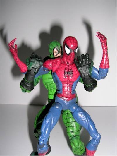
Scorpion comes with only a few accessories, but at least they are kind of cool. His tail fires a missile, of which he comes with three (if I remember correctly) and a newspaper vending machine, which is made of plastic and a vinyl-like material and when it's impacted it crumbles. This is the same idea as some of the stuff that Toy Biz did with it's WCW wrestling toys years ago. I thought that it was mildly cool then, and I think it's mildly cool now. At least it works. Scorpion's missile shooting tail works well and doesn't get in the way of the sculpt much. I don't like action features built into my figures, but it's not an eyesore here, unless you're real picky.
Sandman: ***1/2
Sandman comes with four different "sand-arms" that you can attach to him by popping off his hands at the forearm, and popping the new arm on. The accessories are great because they fit the character and don't get in the way of his look at all. In fact they are a big part of his look. He comes with four arms: one is a mace, another hand-like with a hinge, another with a clamp that has a spring hinge to snap shut on his enemies, and the last is a cool sand-axe, which I think is my favorite. I took a half-star away from Sandman because the arms are a bit stiff, and I'm afraid that with too much use they might break. Also, the pegs that will stick out from his arms when you remove his hands seem a bit fragile and I'm a little afraid of them remaining intact as well. I'd recommend not doing a lot of switching between arms. Find a look you like and stick with it. Of course, I could just be overly cautious. You might have to use your own judgment on that.
Fun Factor - ****
I touched on a lot of this above so I'll summarize here. Spider-Man's accessory isn't great and doesn't work too well, but the figure is so fun that it makes up for it. I would have bought it without any accessories. Scorpion's accessories work well and don't get too much in the way of things. I'm sure kids will have lots of fun shooting the missiles at poor Spidey. Sandman is great and I know that I'm having a lot of fun with him. I'm just worried about breakage.
Value - ****
You should be able to find these for less than $8. I got all three (over a period of about two months) at Wal-Mart for $6.88 a piece.
Overall - Spider-Man, Sandman: ****; Scorpion: ***
Spider-Man overcomes the villain "Bad Accessory" to still score a flawless four stars. He's simply the best Spider-Man figure to date, in my opinion. I've had him since January, and I still think it's an awesome figure.
Scorpion gets a respectable three stars, but could have had more motion in his ankles and chest and a better paint-job from the neck up. He's a great figure, but after being around since January, he's had to resort to taking roles in films like "The Box Under the Bed."
Sandman comes away with a perfect four stars despite my worry of broken arms. I've had him less than a week, so he is currently co-starring with Spidey in the non-motion picture "On Top of the Computer Monitor."
|
|
|

Figure from the collection of
Matt "Venom".
|