|
Packaging - ***
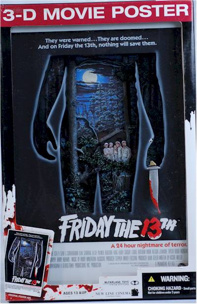
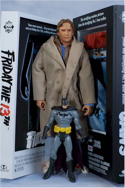
These come in a box slightly bigger than the actual poster. The poster is
inside a cardboard tray, twistied into position with two ties. That
keeps the poster dead center in the tray, so it can be easily viewed through
the window.
The twisties are a tad annoying though, and run through the plastic back of
the poster. While I was able to get the two on the back of Friday the
13th to come out by pushing one end in and pulling on the other end slowly, it
was a no go on Jaws. That poster required removing the six screws in the
back to pull it off, and take out the long twist ties.
The boxes show off the posters fine, but are a tad unexciting
themselves. I'm particularly unimpressed by the very plain "3-D
Movie Poster" across the top of each. But you can easily see the
poster inside the box if you're a MIBBer, although it doesn't look nearly as
good as when it's open.
Sculpting - Jaws ****; Friday the 13th ***1/2
Both of these turned out much more impressive than I had anticipated, and
that's always such a pleasant surprise.
As the title implies, these posters are three dimensional. Both are
around 2" thick (although the Jaws one is about a half inch thicker), and
have multiple layers.
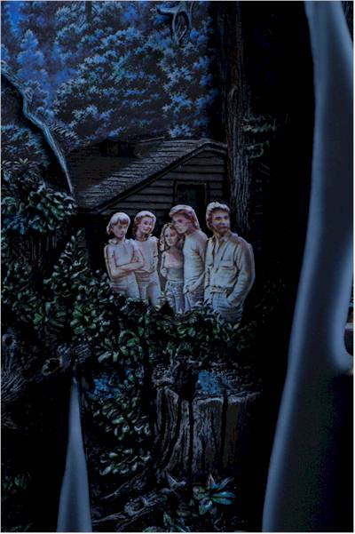
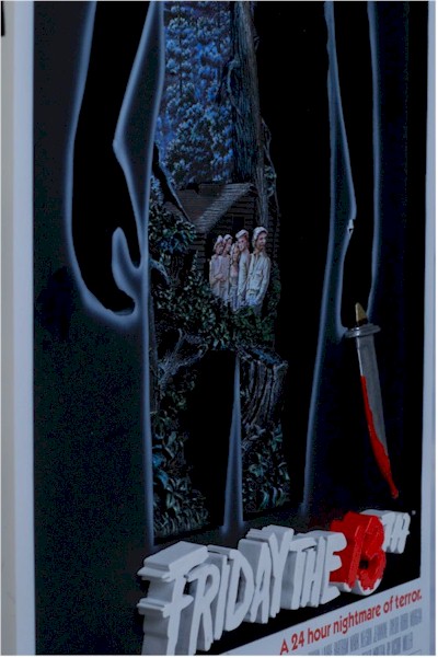
The Friday the 13th poster has the title in block letters which extend
slightly beyond the front of the boarder. The knife also extends out
slightly, coming out from an angle from the end of the hand to above the
number 13. The body is appears laser cut into a hard rubber material,
and the woods, people and cabin are set very deeply inside this die cut.
There's varying levels within too, as the trees, cabin, stump and leaves
are all sculpted. Only the very back image of the farthest trees and the
full moon is flat against the back. Even the victims are sculpted in
this rubber material, set in front of the cabin. This allows for all
kinds of shadows and depth within the poster.
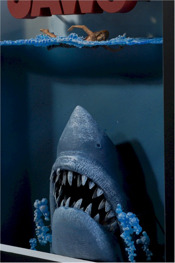
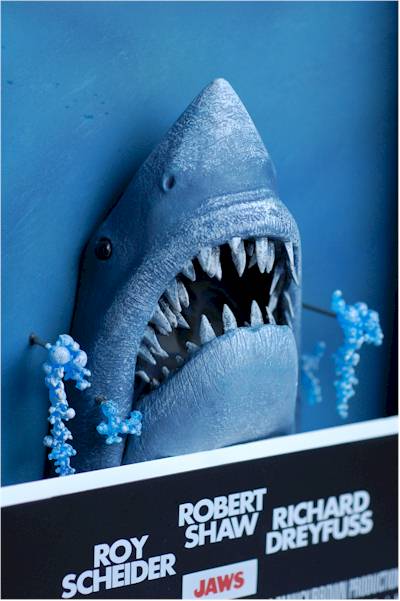
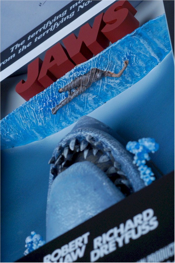
The Jaws poster has less sculpting, since the actual classic image is a
little less complex. Again, the Jaws title is set in solid letters, this
time held off the actual back with steel pegs. These same pegs are used
to hold the cool bubbles off the back, which appear to be floating up as the
shark rises from the depths. Obviously, the shark is sculpted entirely,
and his large mouth juts out in front of the plane of the poster.
Finally, there's the poor girl, swimming in the water above. The girl is
a fairly basic sculpt, but they've done some interesting work on the section
of the body under the water line. The water appears to be flowing past
her as she swims, and even the ripples caused by her front hand breaking the
surface of the water are included in the underside sculpt.
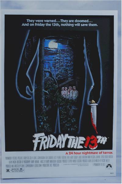
Of the two posters, the one closer to the actual image is the Friday the
13th version. The white boarder was pretty standard in those days on all
movie posters, and the Jaws poster had it as well, outside the black
border. They dropped that for this version, which was an aesthetic
decision. It was a good one too, and the all black border works
terrific.
The Jaws poster also has one other feature that the Friday the 13th one
lacks - a cut out on the top. A wedge was removed from above the Jaws
logo, which allows light from above to shine down. It adds a nice
effect, lighting up the girl and water surface, and adding shadows to the
shark below. Because of the solid rubber nature of the interior of the
Friday the 13th version, it wasn't possible for them to do this same thing,
but I don't think it would have been as effective either.
If you compare this sculpted shark to the poster image of the shark, you'll
be amazed at how accurate the details are, especially the size and placement
of the teeth. They really did an excellent job capturing the shark in 3
dimensions.
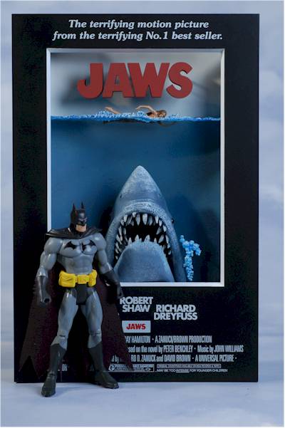
The larger size of these helps make them that much more impressive.
Both posters are 8 1/2" wide, but the Jaws poster is slightly taller at
12 3/4" to the Friday the 13th at just 12 1/4". Jaws is also
deeper, at a full 2" to the others 1 1/2".
If I have one complaint, it's that the front of the Jaws poster doesn't fit
quite tight enough to the body. There's a slight gap along the edge, but it's
really only noticeable from the side.
Paint - ***1/2
As is expected from McToys these days, the paint ops are excellent.
That's not to say they're perfect, but it's pretty close. Of course,
much of the paint work on the interior of the Friday the 13th poster is dark
and dreary, with the majority of the color coming from the moon and sky.
The colors mimic the shadows you'd expect, considering the location of the
moon, adding realism to the scene. The victims aren't painted, but are
instead some sort of transfer or printing right on the surface, so that there
is far more accurate detail.
The water and girl are the real standouts when it comes to paint on the
Jaws set, and the paint work adds to the effect underneath the surface of her
body rippling through the water. The shark is NOT painted accurately, if
you're expecting him to look like a real shark, but he IS painted pretty damn
close to the actual image from the poster. The highlighting around the
mouth and nose gives you the feel of the highlighting on the original poster,
at least as probably as well as they possibly could.
Since both posters are fairly deep, they have wide sides. Mcfarlane took
advantage of that and added the poster logos on both sides in paint, along
with the tag line for Jaws. This makes them look even better if you
choose to hang them on the wall, where the edges would be obvious.
Accessories - **
Hmmmm. These babies were advertised to work two ways. You could
hang them on the wall, or set them on a table with the 'retractable easel'.
I'm not seeing any easel arm, retractable or otherwise.
But you can hang them on the wall easily with the hanger hole provided at
the top center. They also sit up on their own alright since they are at
least 2" thick, but the easel is a missing touch.
Value - ***
You can pick these up in the $18 range at a number of online retailers, and
that's a solid value for what you're getting. At this larger size, they
are much more impressive, and there's a lot more involved in producing them.
Code 3 uses resin for their sculpted relief posters, but ones this size run
around $65, while their small ones (around 5x6") run $25. Their
sculpts and paint are nearly as nice, and Mcfarlane has bested them all
around.
Things to Watch Out For -
Nothing really. If you can't get those pesky ties off the back, don't
try pulling them too hard, since you could damage the back where the screws
attach. Instead, just grab the screwdriver and take the back off to
remove them.
Overall - ***1/2
While it's just as easy to get the poster itself, that's only true if
you're interested in a cheap reprint. Even if you pick up an original
for a higher price, odds are pretty good it will end up looking like this.
Posters from this era, even those sent to theaters, were always single sided
and almost always folded. They don't display well after all these
years.
While these aren't for everyone, I do think they'll look terrific on the
wall of a media room or even a dorm room. The size is a happy medium
between something too small to really appreciate the intricacy, and the often
unwieldy 27" x 40" of a normal poster. This is not a new idea
- Code 3 has been doing it for awhile now - but Mcfarlane took the concept and
improved on it by using better sculpting in cheaper materials.
Score Recap:
Packaging - ***
Sculpt - Jaws ****; Friday the 13th ***1/2
Paint - ***1/2
Accessories - **
Value - ***
Overall - ***1/2
Where to Buy -
I suspect stores like FYE will get these in, but online options include:
- Clark
Toys has them (at least the Jaws one) for just $17, which is a very good
deal.
- Killer Toys has them listed at
$18 each.
- CornerStoreComics has them
both at $20 each.
KEEP SCROLLING DOWN FOR MORE PHOTOS!
|
