----------------------------------------------
----------------------------------------------
----------------------------------------------
--------------------------------------------------------
--------------------------------------------------------
--------------------------------------------------------
--------------------------------------------------------
--------------------------------------------------------
--------------------------------------------------------
--------------------------------------------------------
--------------------------------------------------------
--------------------------------------------------------
--------------------------------------------------------
--------------------------------------------------------
--------------------------------------------------------
--------------------------------------------------------
--------------------------------------------------------
--------------------------------------------------------
--------------------------------------------------------
--------------------------------------------------------
|
You were probably also someone
from a creative background that had a
desire to express your creative freedom. This generally (though far
from exclusively) attracted designers, especially with a graphic,
fashion or product design back ground, at least that’s what I always
seemed to find. It could have a tendency to be cliquey, you had to be
listening to right sounds, wearing the right threads and cruising on
the right board, but lets face it all the best gangs are! But on with
the show:
I emailed Jason (his address is on the box) and told
him I was covering these figures and if he’d be willing to do a short
interview to run alongside my review, he was most gracious in accepting
my request, so here is what he had to say-
Thanks for taking time out to answer a few questions for our readers at
Captain Toy.
JP-
Amongst collectors of Urban figures you are most infamous for your
Gangster Paradise and Monkey Playground 1/6th figures and the
Soundspeaker vinyl collections, but can I ask you to give our readers a
quick potted history of how you got into the toy-designing scene, your
background and influences.
JS- I was invited by a friend who
used to make toys and the first toy designed by myself was “Frey Mui”.
I was influenced by many pop culture such as trap hop music,
graffiti
…I have used to make comics
before I got into toy industry.
JP- Were any particular artists designers or musicians inspirational in
making you want to create vinyl and 1/6th figures?
JS- I coming up with idea with music go along with me, trap hop,
Massive Attack, Portishead…..
JP- How does your design process work, what are your methods?
JS- First of all, I usually think of my concept & idea.
Secondly, I
draft
the initial layout to portray my idea more realistically. But
occasionally, like speaker series, I come across the novelty that makes
me reverse & subvert the process.
JP- Where is home for you, and do you work from a studio/workshop space.
JS- In Hong Kong. I work at my studio in industrial district.
JP- I have to ask how your collaboration with ACI came about.
JS-
I met Brian of ACI, at a design festival 2012 where I exhibited my
works in a showcase. Soon after, I proposed the idea
“Primates” to
him.
JP- Can you tell us a little about the process on Ray
and Brad specifically, how they progressed in going from your initial
sketches through to the finished figures from ACI.
JS- Most
recent years, I realize there are many contradictions and people on
strike in the street like “Occupy Wall Street”. So I was inspired by
those “Camping Protestors” who are conflicting against the
injustice.
In
the procedures of manufacture. Firstly, I got my main theme for the
figures, “ The primate in concrete Jungle” and then I create my
illustrations & painting, finally I make 2D & 3D
sketches for
the characters I created. I made 3D clay models & follow the
process of figure production.
JP- I often wonder if people
truly grasp just how many disciplines original 1/6th figure design
encompasses. Most obviously you are developing character design, but
you also take in product design for the accessories and fashion design
for clothing. I take it you also designed the boxes for these, so you
did the illustration and typography as well. Do you harbour desires to
do more product or fashion design outside of the toy industry?
JS- Yes, I think creativity can be applied to different industry.
JP-
Is there any one aspect you enjoy the most? I was talking to Winson Ma
recently and he said he still gets a big kick out of designing the
accessories!
JS- Every aspect, they do different crucial role.
JP-
With the rapid growth and constantly improving quality of 3D printing
(that can also be colour printed on output), do you see it
revolutionizing the designer toy industry? I can see a future where
figures are purchased and downloaded directly.
JS- In my
opinion, our designer toys work as a tool to portray the unique ideas
and skills to our audience. Our collectors will prefer the real figures
which bring our message and quality to them.
JP- That last
question also opens up a whole can of worms regarding intellectual
property and illegal copying. Have you had any issues in the past with
this?
JS- Yes, I have experience with someone produce the similar speaker as
my design, but without the concept & quality.
JP-
What are your feelings when you first unveil your new creations, like
any artist I would imagine there are feelings of pride but also
trepidation. When you show off your new baby for the first time you
must wonder how the public will react.
JS- When the new figures were launched, I was ecstatic and excited,
because that’s the main motivation for my creative life.
JP- Do you read online reaction to your designs, the internet can be a
loving and cruel mistress in equal measure?
JS- I just ignore the malice, only concern with good advise.
JP-
Can you share any future plans you have, I know Ray and Brad are
intended as the first releases for the ‘Primates in Concrete Jungle’
series, what might follow, and can you tell us a little more about the
V-People line that has been revealed at some shows?
JS- V-people is ACI’s ideas which they want to achieve the Pop culture
market but Special.
JP-
I take it the V-People line has taken some inspiration from the 70’s
group Village People (the Native American was a giveaway), but were Ray
and Brad’s names inspired by Ray Bradbury at all, geeky question I
know, but I had to ask as I think it every time I write their names?
JS- Not exactly, they are only named from familiar neighbor.
JP-
Thanks for your time, it is much appreciated. Finally, do you have any
tips for any people out there that want to get into the toy design
business?
JS- My tips for people who want to get into toy design
business is only to attempt if you have conviction, and only after you
are well prepared.
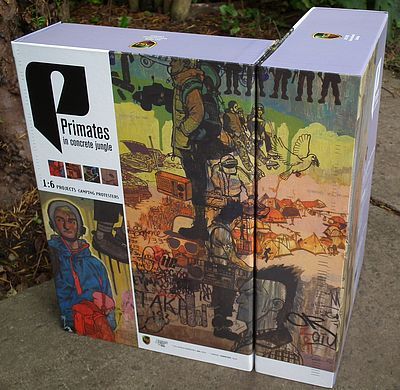
Packaging - ****
I truly love these boxes, they have a charming and quite authentic 70’s
vibe going on. The designs were also by Siu and showcase his prodigious
talents also cross over into illustration and very tasteful typography.
The main body of the boxes are identical, showing an expansive
illustration done in a montage style. I think I could just
about pick Ray and Brad out from the crowd, but this is intended to set
the scene for the flavour of the series, rather than directly
referencing the figures within. The matte quality of the stock used,
coupled with the slightly faded colour palette used manage to give them
a genuine vintage feel, and the retro typography transports me back to
flicking through school library shelves in the 70’s. The actual
construction is a variation on the classic 5 panel, flap fronted box,
but with an extra magnetic flap holding the right side shut. Just lift
this and unwind it to the left and you will see the fully dressed
figures laid out in transparent vac formed plastic trays. Everything
here is collector friendly, and as long as you handle with care you
should be able to replace them with no one knowing.
The rear of the box also has a full production credits list, with
contact details for both Jason and ACI.
Theses are intended to be the first releases from the ‘Primates’
series, so I would imagine they will get plenty of reuses as the line
is fleshed out, and its also worthy of note that there is a sticker on
the side panel with a silhouette and name of the character within. Plus
there is the special bonus of each set coming with Jason’s hand signed
signature on one of the boxes in the set, on mine it was Ray that was
autographed in silver sharpie.
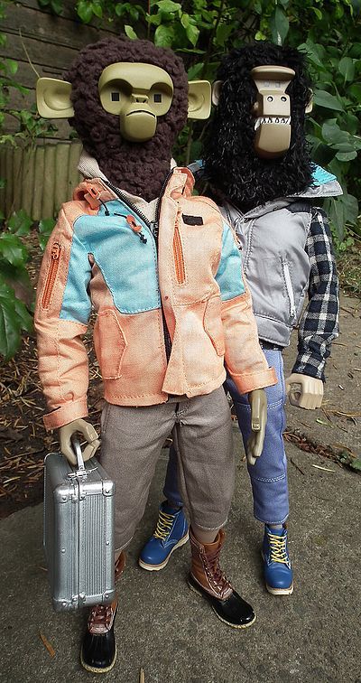
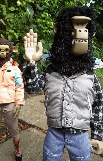
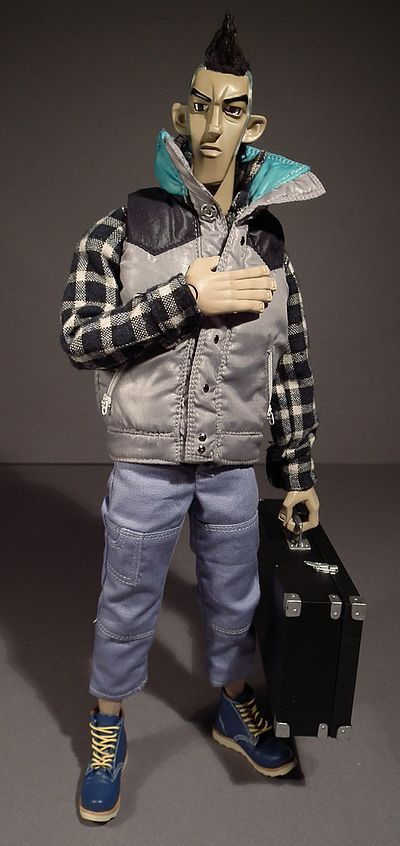
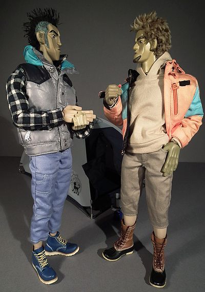
Sculpting - Both Human
and speaker heads **** Ape heads ***1/2
I‘ve said before that when you are in the realm of stylised figures it
is virtually impossible to judge quality in terms of interpretation;
all you can do is bring personal taste to the table and also comment on
the quality of finish achieved by the manufacturer. Luckily these
appeal to me greatly! Both figures showcase Jason’s trademark style,
but also come from a place where they could be displayed alongside
classic urban figures from the past.
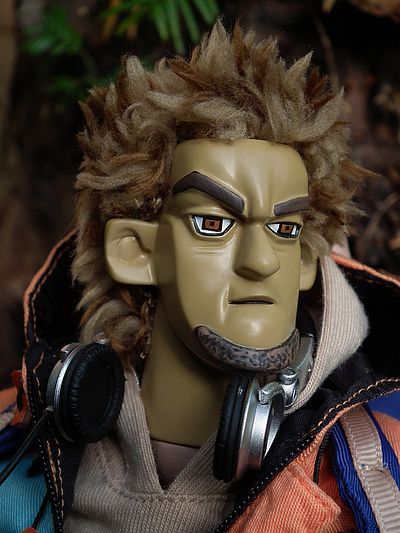
Though both are very stylised they also exhibit a lot of personality,
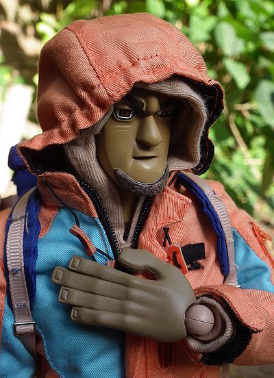
and have individual distinct looks. Brad takes on the mantle of the
slightly more laid-back dude of the two. They are billed as camping
protestors, so are obviously meant to embody a liberal sensibility
coupled with a militant attitude, which they manage with ease. And lets
face it, we all know camping is intense! As I said, Brad does look like
the slightly more hippyish guy of the pair, with his shaggy surf dude
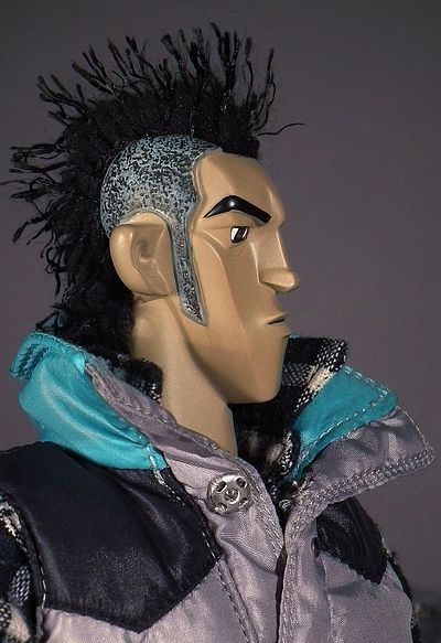
hair and goatee. That’s not to say Ray looks like a bad guy, but his
sharper features, steelier eyes and Mohawk hairstyle make him look a
little edgier!
Both have angular chiselled features and I’d find it hard to pick a
favourite out of the two, but if push came to shave I think Brad just
has the edge. He has a determined expression with his mouth displaying
just a hint of a smirk and his right eyebrow cocked inquisitively. His
goatee just covers the bottom half of his chin, as goatees are apt to
do, lets face it, if it went any further he’d have a full Abe Lincoln!
Both Brad and Ray have large protruding ears, but Brads are less
noticeable because of his unruly mop of hair. The hair itself is made
of soft ‘tufted’ fake fur, and gives the convincing effect of someone
who wants to appear not to care too much about their appearance, whilst
secretly spending ages on it, and caring very much!
Ray has a much leaner look, with long features that are emphasised
because of his lack of facial hair, longer nose and shaved sides of his
head. His expression is equally as serious as Brad’s, and his hairstyle
makes his ears appear even more dominant. He also sports some real
hair, however its made of a different material and is just in a strip
from his brow to the back of his head in the classic Mohawk style (I
wont go into the history of the style now, but I did go over it in a
review once before, so if you are the kind of pedant who wants to
correct my misuse of the name go read this- Ricky Foster review. You’ll find that
both figures hair will need some gentle futzing when you take them from
the box, and make sure you are gentle as if you are too rough you could
risk pulling it out. It’s by no means weak, but just be cautious.
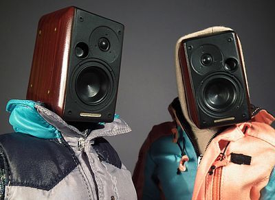
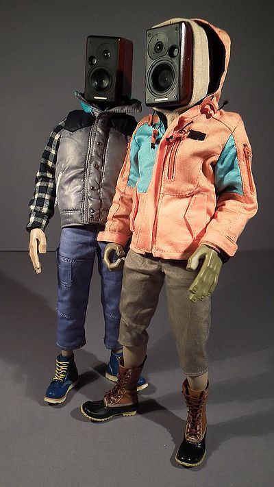
The extra speaker heads are virtually identical with the details on the
front being a mirror image of each other, all the detailing is crisp
and well defined, their inclusion being cool as a Jason Siu trademark
(check out his vinyl Soundspeaker figures) and also handy to sit either
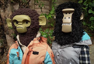
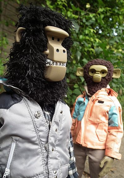
side of the CD case when not fixed to their shoulders. Next up are the
ape heads which are also super stylised, with extreme geometric angular
features which are softened by the use of real fur on the ‘hairy’
parts. I like them, but I prefer the human heads so mine will be
staying in the box, or perhaps displayed separately.
Something I will mention here is just how sweat inducing the swapping
over of the heads was. You will find that you need to apply a lot of
heat to make the vinyl of the neck soft enough to swap over, in fact I
found it so nerve wracking that I only did one (Brad from human to
ape), all the other pics I took to show the alternate heads were done
using a blob of Blu-Tack. The simple inclusion of neck posts attached
to the ape heads, and a couple of extra for the speakers could have
solved this problem and I hope they consider this for future releases.
They also come with two sets of hands each, one pair gripping and one
pair flat. These are the same sculpts for both figures and the
exaggerated angular style has quite a cubist feel to it. They are also
intentionally oversized, and the general design and sculpting is
executed beautifully. My only wish would have been for a few more
different poses, but more on that in accessories.
In short, from a sculpting angle there is virtually nothing that I can
find to complain about, so if you are a fan of this kind of figure, and
the price doesn’t make you baulk, I can highly recommend!
Paint - Brad *** Ray ***1/2
When looking at stylised figures, from the massed ranks of the ThreeA
‘human’ figures, through to the classic Brother Workers and indeed
Sui’s own Gangster Paradise collections, you will realise that
hyper-realism is not the order of the day here!
To enhance the extreme features a simpler palette is utilised, but what
is demanded is a super crisp application that is so perfect it looks
almost like you are looking at a 3D illustration made real! For the
uninitiated, imagine if you will Jamie Hewlett’s Tank Girl or Gorillaz
in a solid 1/6th form!
So I’m pleased to report that most of the paint app here is very
precise, but there are just a few issues that keep it from perfection.
The human heads are very strong, with nice clean work on the eyes and
eyebrows, and indeed the mouths are relatively crisp and precise.
Likewise the speaker heads (which are mirror imaged identical sculpts)
have some great work on the wood grain effect. However I did find that
the ape or ‘Primate’ heads were just a little less accurate… certainly
not sloppy, but lacking the clarity of precision one expects. Nothing
truly bad, but at the price-point these two are at, one does expect a
higher degree of flawlessness!
The other thing that drops Brad’s score an extra half star is the fact
his hands are a much darker skin tone than Ray’s. Not only is this
marginally darker than this face, but it is way darker than the base
plastic used to construct his body, so you’ll have to keep the sleeves
on his hoodie and jacket pulled down to hide the transition line. And
likewise it means where his shins are on show between the boots and his
flood pants is visibly too light compared to the rest of his
colouration (unless of course Jason intended him to be Brit, in which
case this is not an unusual look, you’ll often see us on holiday abroad
with a tanned face and arms, but fish-belly white legs and body… it’s
the English way!).
Articulation - ****
These guys come on ACI’s stock 1/6th body which has a great range of
mobility, its basically everything you want from a modern body and has
what is credited as 30 points of articulation. This means it basically
offers pretty much all the poseability of a TT and was more than up to
the job here!
I just wish the heads had been easier to swap!
Accessories - ****
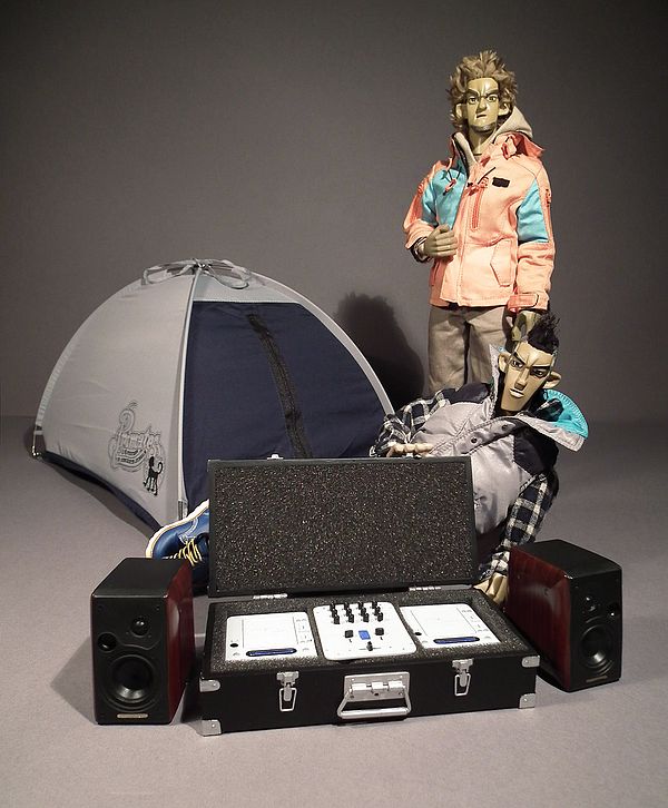
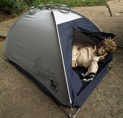
These guys come with a great selection of extras; firstly there is the
dome tent that comes bagged up in a drawstring sack. Its made of what
appears to be real nylon tent fabric and has a metal frame that needs
to be threaded through the seams, putting it together was a doddle and
it actually makes for quite a cool little display item. It has a
working zipper up the front, stitched ribbons on top for tying to the
frame and a Primates in Concrete Jungle logo printed on both the side
panels.
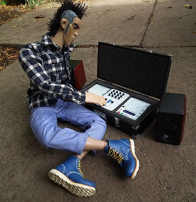
Then Ray comes with-
1 extra speaker head
1 extra Primate gorilla head
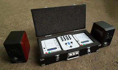
1 carry case with twin CD players and a mixing unit
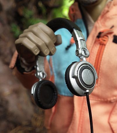
1 pair of headphones
1 shoulder bag
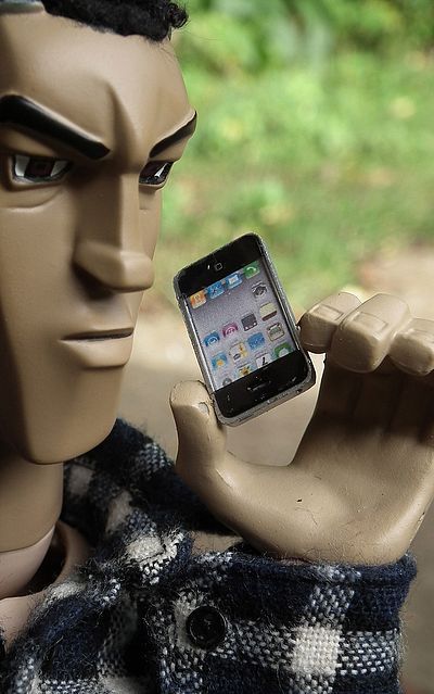
1 smartphone
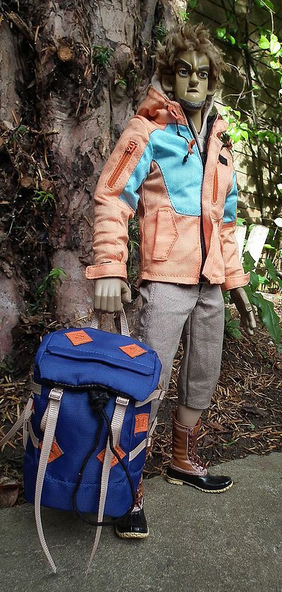
Then Brad has-
1 extra speaker head
1 extra Primate chimp head
1 camera case/metal attach� case
1 pair of headphones
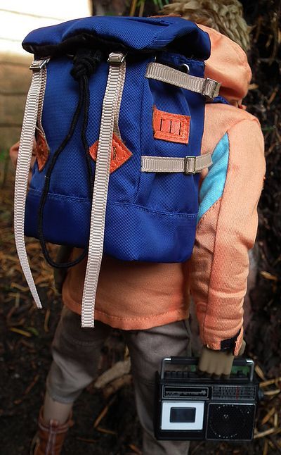
1 Bergen/backpack
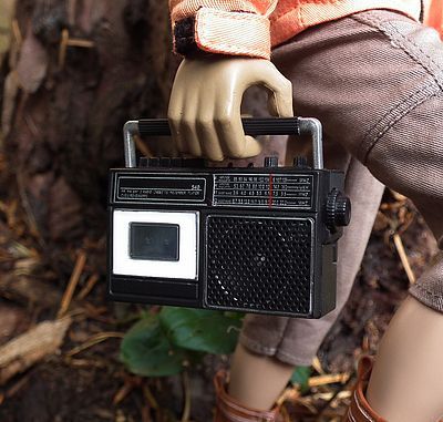
1 classic 70’s style large tape player/transistor radio
1 smartphone
So all in all we get a pretty
sweet and well-detailed selection. Could it be improved upon, well of
course, the CD players could open and have tiny insertable disks, and
it the tape deck had been able to flip open and had a miniature
cassette inside I’d have been over the moon. However, they would
perhaps have overcomplicated things and may have made things even more
expensive, not to mention horrendously fragile! As it is the radio does
have a hinged handle and the aerial can flip up to an upright position
(but at this scale is obviously not telescopic). And the twin CD’s and
mixer do come in a foam surround case that like the smaller silver case
can open and shut with working hinges and miniscule working
clasps/latches. They also come with bags; Rays being a satchel/holdall
design with a padded adjustable carry strap and small working pockets
that have tiny functioning zips and buckles. Brad has a larger Bergen,
but again it has working zips, straps and drawstrings.
Being groovers on manoeuvres they keep abreast of the latest happenings
with twin smartphones, but then manage to drag things back a few years
by having a more retro vibe with some classic old-skool cans. No Beats
by Dre here! The headphones are made of a softish vinyl that gives the
right texture for the leather parts and has working hinges on the
speakers and there is also a length of flex that has wire in it to aid
in the posing.
So a cool little haul, and if I had to pick out my favourite items it
would have to be the retro transistor radio and tape player, with the
tent coming in a close second!
Outfit - Brad ****, Ray ***3/4
The attention to detail here is pretty darned impressive, and the
quality of tailoring is excellent throughout… so why no full score for
Ray?
Well, it’s only just short of a full score, and the reasoning is the
thick fabric used on his shirt that does end up looking a tad bulky.
Funnily enough I can remember having a heavy Stussy checked shirts back
in the 90’s that was made of such thick woven cotton that it was as
warm as a sweater, so maybe its intentional and that is the look they
are going for here. But even so, the scaled fabric would still feel too
thick on this occasion.
Ray’s wardrobe consists of-
- Black and white checked shirt
- Grey/blue padded gilet with stud fasteners and working zippered
pockets
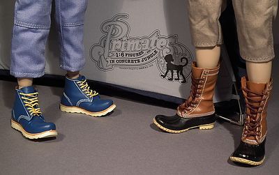
- Blue mid-calf trousers
- Blue moulded boots with lace-up feature
As I said, the shirt does seem a
little bit thick, most noticeably at the collar and cuffs, but the
overall cut and finish are still excellent. It has metal studs up the
front and Velcro tabs on the cuffs, but tiny buttons are sewn on the
front, cuffs and onto the flaps of the patch pockets to help in the
look of its scaling. The blue trousers have a mid calf length and have
working pockets throughout, nicely executed but a relatively
straightforward garment. His gilet however is a far more complex item.
Its made up of panels of sky band dark blue with a main body of light
grey. It has metal studs concealed to fasten the front with tiny studs
glued on the front panel to mimic scaled fasteners, and miniscule
working zips on the pockets. His boots are made of moulded plastic, but
have super fine detailing on the paint applied to the soles and
stitching, plus they have real laces threaded through the eyelets to
add to the realism.
Brad has-
- Beige hooded sweat top
- Orange and blue jacket with working zippered pockets
- Tan trousers
- Brown boots
The standout garment in Brad’s
ensemble is the jacket, it’s not of a style I would ever choose to
wear, being of the ‘outward bound’ hiking and orienteering type of
thing (not my bag). However, the detailing is quite excellent. Like
Ray’s gilet it has working pockets and similarly utilises super tiny
scaled zippers, it also has adjustable Velcro cuff tabs and small
working pull cords around the neck and hood. Under this he wears a
straightforward hooded top, simple and classic in its design but again
fabricated beautifully. It might have been cool to include a
design/print on its front, but it certainly doesn’t suffer for its
omission. He also wears short trousers that go just below the knee, but
have a simpler design than Ray’s. I’m very fond of his boot design, but
I’m biased as I have a pair very similar, as the main body has a ribbed
toe like a pair of galoshes but with a tan leather collar, these are
also made of moulded vinyl and have working laces like Ray’s.
That is pretty much it in its essence, and apart from the fabric on
Ray’s shirt being a trifle thick I have no issues at all, just two
beautifully put together 1/6th civilian outfits!
Fun Factor - ***
These are definitely a duo of fun toys, and they pose like a dream, but
they are also very much adult fare. This fact is evident of course both
in concept, (anti-establishment protestors, hinting at a healthy level
of civil disobedience ‘fight the power!’) and also because of their
price bracket which will keep well out of the reach of those operating
on a pocket money basis!
These are meant to be purchased and then displayed knowingly in a
cabinet or on a shelf (perhaps whilst gently stroking your chin) and
admiring their post-modern sensibilities. Of course you should also get
a kick out of their real world play value, they are after all two very
cool and poseable dolls… but not being soldiers, superheroes or aliens
they will only appeal to a niche market. If you happen to be one of
those within the target demographic, I know in my heart you will see a
ton of fun in these… and you certainly won’t be one of those chin
strokers… you’ll be like me, a big kid who just loves toys in their
purest form… toys for toys sake, that just happen to be designed for us
not so grown-ups!
Value - **
In real terms these do not represent a great deal and will certainly
never be looked upon as a bargain, with an asking price of $550 for the
pair they are way more expensive than many of Hot Toys top of the range
fully licensed products. However that would be far from a fair
comparison. These are aimed at a totally different audience, one less
concerned with the latest figures from a Hollywood blockbuster or video
game, but more interested in the unique vision of a named artist. It is
also more than worthy of note that these have an edition size of just
250 sets worldwide, and one box from each set (Ray on mine) is hand
signed by their creator. I guess for those that like the ‘security’ of
a numbered certificate, it might have been a cool thing to include, and
would have afforded Siu the opportunity to include some sketch work and
images of the design process.
However that is not the case, we don’t get a certificate, but we do get
that signature on the box, and when you look at the fact there only 250
of each character on this planet, it drives home what an insanely small
edition size that is! I can honestly say I’d rather an edition size of
500 split the difference and make them $400 a set, but in real terms
price is not an issue here as they sold out to their intended buyers
within days of going on sale.
Of course that means you’ll now be lucky to find a set for under $600,
and that price is bound to rise as more Jason Siu fans who missed the
original release become aware of them and scramble to get hold of a
set! Hence my score is based on that of an average punter. If you are
more of a designer toy aficionado you might just consider the price
something of a bargain… especially if you read this review from the
archive in a year or so from now!
Overall - ***1/2
These guys are well articulated, well dressed and come with a solid
haul of goodies. They also arrive with a selection of three heads each
(not bad by anyone’s standards) and the build quality is excellent.
However with a breakdown cost of $275 each (if you chuck in half a tent
per character, or just look upon it as a bonus as it is packed
separately) they are to us regular collectors in a price bracket that
could seem pretty excessive. But even though I am in danger of sounding
like a broken record, the collectors of mass appeal licence lead
fan-boy favourites are not the crowd these are designed to please. And
the fact they sold out in the blink of an eye says they pleased their
intended audience greatly. Add to that the fact that I could only find
two sets available on the secondary market, it would lead one to hope
that the small quantity available has ended up in the hands of the true
Jason Siu collectors, rather than the traders and scalpers!
As such I felt tempted to give these a full score, but hey, I need to
keep it real, so taking into account the few small niggles I had with
the paint and remembering that $550 is a whole heap of wonga, I have
kept these just short of an elusive full score. But if you are the kind
of collector who has a room with cabinets and shelves display the art
of the likes of Brothers Worker, Michael Lau, Eric So and others, then
these two will probably be getting a full score and a whole heap of
respect!
Where to Buy -
At the time of writing ACI had sold out of sets available direct from
them, but you can still view the spec and see the official photos here.
However some were still available on eBay.
There was a set without the tent included for $600 or you could
purchase Ray on his own for $328 and Brad for $318. Good luck!
Discussion:
Want to chat about this
review? Try out one of these terrific
forums where I'll be
discussing it!
Enjoyed this review? Be sure to head back to the main page to find
thousands more just like it!
KEEP
SCROLLING DOWN FOR MORE
PHOTOS!
|